You can change the entire ambiance and look of your home by picking out the right wall colours. Different colors can give a room a larger, bolder, warmer, more soothing or more refined look. But there are many variations and hues to choose from, making it difficult to decide on which colours are best suited to go together.
Whether you’re decorating a brand new space or sprucing up an interior, a thoughtful use of colour can help you ensure that the room is balanced and pleasing to the eye. There are a number of things that you can take into account when making your choice on natural light, colour, and so on. If you are looking for the ideal wall colours scheme to decorate your house, here are 10 practical tips that will help you decide.
1. What are the Guidelines for Determining the Size of the Room?
One of the first considerations when choosing wall colours is the size of the room. Light hues like white, cream, beige, soft grey and pastel colors can help to open up a small space. They scatter light and bring about a lightness in the scene.
In bigger rooms, you can get a little more creative with the colors that you use. Navy blue, olive green, charcoal, terracotta and warm brown can be used to add depth and character without overpowering the room.
Light and dark colours can be used together, too. For instance you can have 3 light walls and 1 darker accent wall which will provide a nice focal point, but still will not overpower the area.
2. Will Natural Light Change Your Wall Colour Selection?
The appearance of a colour can vary greatly as the day goes on, depending on the natural lighting. The color you see in the paint shop can be very different from the color you see on the wall.
Light-filled rooms can be visually appealing in cool and neutral shades of blue, green, grey and off-white. These shades have the ability to complement the warmth that is caused by harsh sunlight.
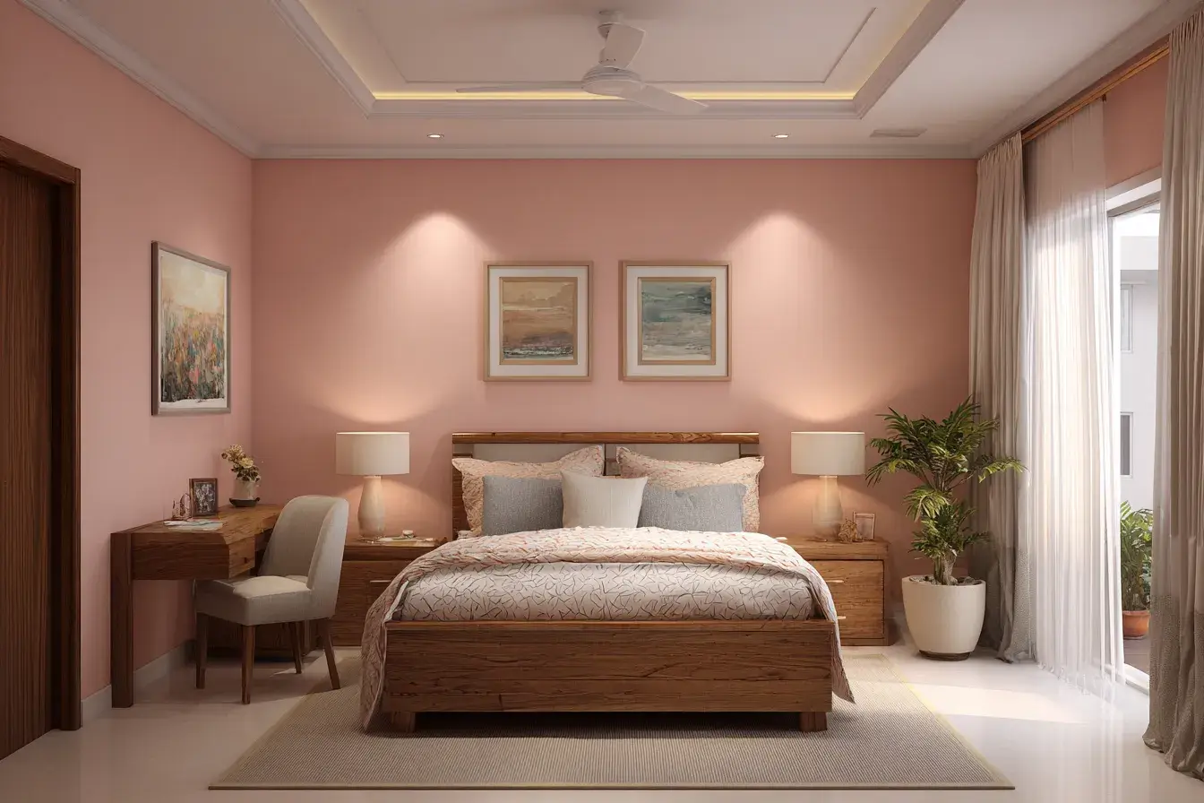
Warm tones like cream, warm beige, peach, soft yellow or light taupe can be ideal for rooms that don’t have a lot of natural light. These shades can help to brighten up the room and make it more welcoming. In the meantime, take note of the appearance of paint samples throughout the day to get an idea of how light changes the appearance of paint before making a final decision.
3. How to Coordinate Wall Colours to Furniture?
The wall colours ought to match your existing furnishings instead of clashing with them. Before you choose paint colours, consider the predominant colours in your sofas, curtains, rugs, cabinets, paintings and other decorative items.
Bold furniture colours or patterns can be balanced by neutral wall colours. A beige or soft grey wall, for instance, can be stunning with colorful furniture.
Walls can add a more personal touch to a mostly neutral furniture. An accent wall in a muted green, dusty blue, terracotta or deep navy can bring interest to the design. The aim is to achieve a unified interior, with the walls and furnishings appearing to be part of a unified design.
4. Should You Use the 60-30-10 Colour Rule?
A 60-30-10 rule is a simple interior design concept that can be used to help achieve balance in colour combinations. This theory suggests that about 60% of the room should be in a primary colour, 30% a secondary colour and 10% accent colour.
A light beige color on most walls, a muted brown on the furniture or curtains, and a rich green through cushions or decorative items, for instance.
This way the room will not become “crazy” but you can still add contrasting colours. It’s not a hard and fast rule, but it can be a helpful guideline for creating your interior color scheme.
5. What Colour Combinations are Good for Living Rooms?
The living room is a common space to gather in the house, and the colour scheme should be comfortable and welcoming. Neutrals like beige and cream, white and light grey, taupe and ivory can make for a chic look.
If you’re looking for a more modern answer, you might want to try mixing your grey with navy blue, white and charcoal, or cream and olive green. For warmth, try terracotta, beige or muted brown with cream.
An accent wall can also add interest to the living room. Pick a shade that fits in with your furnishings and style instead of just going for a popular colour.
6. What Colours Do You Decide to Paint in a Bedroom?
Bedrooms should generally have colours that promote a relaxing and comfortable atmosphere. To make a peaceful environment, soft blue, sage green, lavender, warm white, beige, or muted grey colors are popular.
To create depth but not overload the space, you can pair two complementary colors together. For instance, a soft blue wall with white accents can offer you a new look, beige or light green can provide a natural and calming feeling.
For those who like dark shades, you can try just one wall behind the bed instead of all the walls in the room. This provides a dramatic focal point and balance.
7. Can Accent Walls Improve Your Interior Design?
If you want to add a more pronounced colour but don’t want to overwhelm the room, an accent wall is a great way to do it. Paint one wall in a bright color and the rest of the walls in a neutral.
An accent wall is a perfect fit behind a TV, sofa, fireplace, dining table or bed. For instance, if the walls of the room are cream-colored, the accent wall in the room can be dark green. Likewise, light grey walls can be complemented by a dark blue accent wall.
If you are going with an accent colour, think about all the other colours present and pick one that seems to merge with the furniture, flooring, curtains or artwork in the room.
8. What are the Colours you Select for Various Rooms?
Not all rooms may require identical colour schemes as they have different functions. Rather, blend the images together and give individual rooms their own personality.
Warm neutrals and welcoming tones can help create warm spaces. Bedrooms can be a more relaxed and quiet room in a more subdued and muted color palette. White, cream, grey, sage green or light earthy colors can be used in kitchens.
Light blue, white, grey, beige or green is a good colour scheme for bathrooms. Accent walls, furniture or accessories can all be used to add some playfulness to kids’ rooms. Utilizing associated tints all over the home can help create a unified feel.
9. Do You Test Paint Samples Prior To Painting?
A small colour card doesn’t always make a big impression when choosing a colour scheme for an interior. The colour of paint can vary from room to room based on the room size, lighting, surrounding colours and wall finish.
Put samples in various places on the wall and watch them during the day. Observe the specimens in natural light as well as under artificial light.
It’s also a good idea to position furniture or fabric samples in front of the paint to observe the color interactions. It might be helpful to make sure that you won’t make any major mistakes or run into any issues that may cost you more money than you would like to spend, since you can test before you paint the whole room.
10. How to Make Trendy & Timeless Colors Work?
Color schemes come and go, but perhaps it’s not possible to redo your home interior every time a new trend arises. Instead, it’s best to have classic colors as the base and add in trendy colors in smaller accents.
White, beige, cream, taupe and soft grey are neutral colors that can serve as a base. Then add in chic hues on cushions, curtains, rugs, artwork, furniture or with one accent wall.
If you enjoy a trendy and bold colour, then try to use it strategically, rather than on all the walls. This will allow you to make a change in the interior with ease if your tastes change.
What Are Some Common Wall Colour Combinations to Try?
If inspiration is needed, there are a number of colour combinations that can complement modern homes in a good way. Cream and beige offer a warm and sophisticated look, whereas white and light grey give a clean contemporary look.
Sage green and cream can add a natural feel to interior spaces, while navy blue and white will form a classic contrast. Warm hues like terracotta and beige can help to evoke a sense of comfort, while neutral shades such as blue and grey can lend a sense of calm and modernity.
Keep in mind the ideal mix will vary based on lighting, furniture, floor, size of room, and taste. The colour that suits one house may not suit another.
Why is Colour Balance Important in Home Interiors?
Colour balance is vital to harmony among the various parts of a room. A strong colour for every wall, piece of furniture and accessory can make the space look very colourful. Too many shades of the same color can make a room appear two-dimensional, however.
You can use a strong neutral tone along with a secondary color and a subtle accent color, which can add some interest without overpowering.
Consider colour as a whole interior design element instead of walls as a separate element. Flooring, furniture, lighting, curtains, artwork and accessories should all fit into the overall palette.
Final Thoughts
It is not difficult to select the right wall colours combinations. Taking into account different factors like room size, natural light, furniture, colour balance, and the use of each room, one can achieve a comfortable and aesthetic space.
Choose some colours you feel you like, sample them in your walls and see how they appear in various lighting situations. Depending on your taste, you can achieve neutral elegance, earthy natural tones, strong contrasts, or soothing and calming hues that will bring a new and inviting look to your home.
Most important is to pick colours that are appropriate to your personality and comfortable in your home. Carefully chosen colour schemes can make your home more inviting and form a harmonious and aesthetic interior that will last you for years.